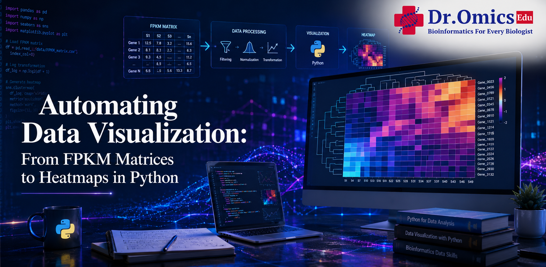
Automating Data Visualization: From FPKM Matrices to Heatmaps
Dr. Omics Edu Team ·
In the transcriptomics landscape of 2026, the ability to transform raw expression values into intuitive visuals is a baseline requirement. While FPKM (Fragments Per Kilobase of transcript per Million mapped reads) matrices are standard outputs of RNA-seq pipelines, they are rarely "plot-ready." Automating the transition from these matrices to high-impact heatmaps requires a blend of statistical preprocessing and advanced bioinformatics data visualization in Python and R.
1. Preprocessing: The Road to a Clean Heatmap
Before plotting, a raw FPKM matrix must undergo normalization. Plotting raw FPKM often results in a "washed out" heatmap because a few highly expressed genes (like housekeepings) drown out the variation in others.
- Log-Transformation: Most analysts apply $log_2(FPKM + 1)$ to stabilize variance and make the data more normally distributed.
- Row-Scaling (Z-score): To compare expression patterns across genes with different baseline magnitudes, we calculate Z-scores ($z = (x - \mu) / \sigma$). This highlights whether a gene is "up" or "down" relative to its own average across samples.
- Filtering: Removing "low-count" genes that show little to no variation across conditions prevents the heatmap from becoming cluttered with biological noise.
2. Python Automation: Seaborn and PyComplexHeatmap
Python has become the 2026 leader for integrating visualization directly into machine learning workflows.
- Seaborn clustermap: For quick, publication-quality visuals, sns.clustermap() is the workhorse. It automatically performs hierarchical clustering and adds dendrograms.
- PyComplexHeatmap: As datasets grow in complexity (e.g., single-cell multi-omics), PyComplexHeatmap has emerged as a specialized library. It allows for "rich annotations"—adding bar plots, box plots, or scatter plots directly alongside the heatmap rows or columns to represent metadata like "Cell Type" or "Patient Age."
- Interactivity: Using Plotly, you can turn static tiles into interactive tools where hovering over a cell reveals the exact FPKM value, gene name, and p-value.
3. R Interactivity: Beyond Static Plots
While Python is great for pipelines, R remains the king of customized aesthetics.
- ComplexHeatmap: The R package ComplexHeatmap is the gold standard for plotting multi-omics data. It can "stack" multiple heatmaps—such as gene expression next to DNA methylation—ensuring the rows are perfectly aligned.
- Interactive Heatmaps in R: With the InteractiveComplexHeatmap package, any static plot can be converted into an interactive Shiny application with a single line of code (htShiny()). This allows researchers to "brush" a cluster of interest and immediately export the list of genes for downstream Gene Ontology (GO) analysis.
4. Visualizing the Multi-Omics Era
In 2026, we rarely look at one data type. Effective visualization now involves:
- Circos Plots: Showing high-dimensional correlations between genomic blocks.
- Network Layers: Overlaying expression data onto metabolic pathways (KEGG) to see which biological "circuits" are actually firing.
Conclusion: Data-Driven Decisions
Automating the jump from FPKM to heatmaps is about more than just aesthetics; it’s about pattern recognition. By mastering these tools, you move from staring at a million-cell spreadsheet to identifying the specific gene clusters that define a disease phenotype. Whether you choose the integration power of Python or the aesthetic precision of R, your visualization should be the bridge between raw data and biological discovery.
